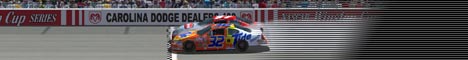
Thanks for all of the comments, those drops though are supposed to look like firecrackers, but they didn't come out good so it looks horrible and I agree. This is the first thing I've made next to the one with the M&M logos on it. The M&M logos are supposed to go in the "drops"
I can see both points. Compared to other stuff we see here, that base is not that good. RNC just didn't manage to use the right words. But uploading stuff, getting (constructive) criticism and suggestions on how to improve is the only thing that takes you further. So don't let anything or anyone discourage you and keep doing your thing. And you know what? That base inspired me to an M&M's base I'm gonna do tonight. The idea is pretty good actually. Small hint from me: If you have to paint ingame and have no possibility to get Photoshop or Paintshop Pro, antialize the lines anyway. Place a dark yellow stripe with 1 pixel width between the black and the white parts and same with other colors to make them flow into each other better.
I think it looks pretty good. Just try cleaning up those edges a bit and it'll look better. By the way, just wondering what are those "drops" on the sides, roof, and tv panel?